Overview
The Museu Nacional de Arte Antiga (MNAA) is Portugal’s leading museum for pre-19th-century art. Located in Lisbon, it houses a vast collection of Portuguese and European works, reflecting the country's rich cultural and artistic heritage.
This project focused on redesigning the digital experience for the Museu Nacional de Arte Antiga (MNAA), Portugal’s premier museum for pre-modern art. As a UX/UI Designer, I led the user research, ideation, and interface design with the goal of making the website more user-friendly, informative, and inclusive.
Process

Discovery
According to the "Público do Museu Nacional de Arte Antiga" report, the majority of MNAA visitors are women aged 35 to 64, with 66.5% employed in intellectual and scientific professions. Their main motivations include a strong interest in the museum and the desire to revisit the permanent collection.
To build on these insights, a thematic analysis of online reviews was conducted, alongside an evaluation of competitor websites, revealing key usability issues and opportunities for improvement. These findings supported the creation of a user persona, the definition of a clear problem statement, and the identification of areas where the website could deliver a more distinctive and user-centered experience.

Key Issues Identified
- Unclear communication Visitors struggled to find accurate info on hours and closures, leading to missed exhibitions.
- Rigid Visit Structure The fixed itinerary felt limiting; more flexibility could let visitors tailor their experience.
- Insufficient Context Lack of artwork details left visitors without deeper understanding or appreciation.
- Buried Information Important details like schedules and closures were hard to find, causing confusion.
- Mobile Accessibility The site wasn’t mobile-friendly, making it harder for smartphone users to access key info.
Problem Statement
Visitors struggle to plan and enjoy their museum visits due to unclear communication, limited flexibility, lack of contextual information, and poor mobile accessibility. The current digital experience fails to provide essential details in an accessible, user-friendly way, resulting in confusion, missed opportunities, and reduced engagement.
Heuristic evaluation of the existing website
Next, it was essential to evaluate the museum’s current website to identify usability issues through a heuristic evaluation.

The system hinders information discovery, complicates the journey for new users, and lacks shortcuts for advanced users. The pages are excessively long.
The interface is outdated and unintuitive, with a lack of organization in both content and navigation. Additionally, the sidebar menu competes with the main information, and the footer repeats information already in the header, missing the opportunity to use this space for more important information for new users.
The existing UI includes a bulky header menu without a clear sub-navigation structure, contributing to a disorienting experience. The hero banner also poses accessibility challenges, depending heavily on the image displayed for readability and contrast.
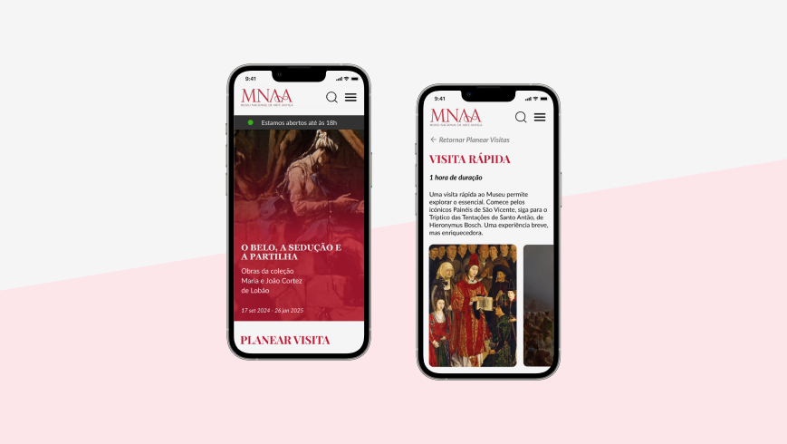
Critically, the homepage fails to surface essential visitor information such as ticket prices, opening hours, and museum rules, creating uncertainty and friction in the user journey. To address these shortcomings, a Mobile-First approach was adopted, since the current website lacks a fully responsive or optimized experience for mobile users.
Recommendations for Improvement

Enhance Communication
Improve information clarity and accessibility for visitors.

Flexible itineraries
Itinerary recomendations for personalized visitor experience.

Provide information
Add content about the artworks, artists, and themes to enrich the visitor experience.

Improve navigation
Make key info easy to find with a dedicated visitor info section.

Mobile optimization
Create mobile-friendly version for smartphone users
Persona

Maria Historiadora, a 55-year-old European woman, is passionate about history and culture. She regularly travels to discover new places, seeking museums that blend art and historical context, and enjoys photography and local cuisine. While in Lisbon, she was eager to visit the National Museum of Ancient Art, hoping to connect with the Age of Discoveries as highlighted in her travel guide.
- Maria values museums that offer engaging local history and cultural context.
- She wants a smooth visit with clear info, good facilities, and practical policies.
- Maria values museums that offer engaging local history and cultural context.
- She wants a smooth visit with clear info, good facilities, and practical policies.
- Beautiful garden providing a pleasant outdoors experience.
- Finds useful and relevant information, including historical context for each exhibit.
- Easily locates desired content, such as exhibit details, visitor amenities, and ticketing options.
Strategy
At this stage, the main objective was to define the structure and behavior of the new website, with a particular focus on the homepage. After identifying key structural issues in the existing website, a revised site map was developed to establish a clearer, more intuitive navigation framework.

Competitive analysis
Once the overall layout and key components were established, a competitive analysis was conducted to examine how other museum websites addressed similar challenges. Insights gathered from this research were combined with internal brainstorming sessions, leading to a set of ideas tailored to the specific needs of MNAA and its users.

Wireframes
Next, paper wireframes were created to visualize early ideas with low commitment. This approach allowed for quick iterations and easy adjustments as the concept evolved.

Low-fidelity prototype
The concept was then translated into an interactive low-fidelity digital prototype, allowing for early testing of structure, navigation, and user flow.

Design
Finally, it was time to bring the ideas to life. Building on insights from the previous phase, the focus shifted to defining the visual direction of the final design. Key decisions were made around color palette, typography and hierarchy, iconography, and other UI elements to ensure a cohesive and accessible user experience.
UI Kit

High Fidelity Prototype
After refining the wireframes based on user feedback, the project moved into the high-fidelity wireframing phase.
This stage focused on translating the improved structure and functionality into a visually accurate design, incorporating the final layout, branding elements, and interactive components to closely reflect the final user experience.
What I Learned
Working on the MNAA project taught me the value of deeply understanding user needs through research and empathy mapping. I learned how critical it is to validate problems early and incorporate feedback into iterative design processes, ensuring every solution aligns with both user expectations and organizational goals.