Overview
Mobi.E is Portugal's national electric mobility network, responsible for managing and promoting the public charging infrastructure for electric vehicles (EVs). As EV adoption continues to rise, the accessibility and clarity of information provided through digital platforms is crucial to supporting a smooth user experience.
For this project, we focused specifically on improving the user experience of the Mobi.E website. Our aim was to address key usability challenges related to how users search for information, understand charging procedures, and access support. By taking a user-centered approach, we worked to simplify navigation, clarify content, and enhance the overall efficiency of the website ; helping both new and experienced users make the most of the platform.
Process

Discovery
At the time of the project, Mobi.E was growing alongside the rise of electric vehicle usage in Portugal. As the main public EV charging platform, its website was a crucial tool for users ; from newcomers to regular drivers. However, despite being functionally complete, the site had major usability issues: users struggled to find information, understand key processes, and navigate effectively.
To better understand user needs and pain points, we began this phase with a comprehensive assessment of the current experience ; including Desk Research, stakeholder interviews, Heuristic Evaluation and a questionnaire ; allowing us to define clear opportunities for improving the clarity, accessibility, and overall user experience of the site.
Desk Research and User Interviews
To understand users' real challenges with Mobi.E and the public EV charging network, we conducted desk research across platforms like Portal da Queixa, Reddit, and YouTube, identifying common frustrations and misconceptions. We also interviewed EV users to gain deeper insight into their daily experiences. A key theme that emerged was confusion around Mobi.E's responsibilities, often resulting in misplaced blame and damage to its public image ; a major issue we sought to address in our redesign.
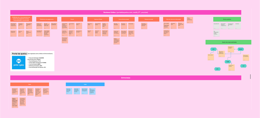
Key Issues Identified
- Lack of clarity about Mobi.E's role Users are frequently unsure who is responsible for specific problems (e.g. charging station failures or billing), leading to frustration and misplaced blame.
- Poor availability and reliability of charging stations Complaints about malfunctioning, unavailable, or under-maintained stations are widespread and deeply impact the user experience.
- Difficulty accessing clear pricing information Users struggle to understand how much they will pay, especially given the involvement of third-party providers and varying price structures.
- Low perceived support and responsiveness Many users feel abandoned when they face problems, citing delayed or unclear responses from support channels.
- Overwhelming or missing information on the website Users experience unclear or failed payments and lack transparency about transaction flows and responsibilities.
- Payment-related issues and a confusing transaction process The current structure does not effectively guide users or answer their most urgent questions, resulting in confusion and frustration.
Heuristic evaluation of the existing website
To identify usability issues on the Mobi.E website, we conducted a heuristic evaluation based on Nielsen's principles. This helped us uncover key problems in how the site communicates, functions, and presents information.
We identified three main areas for improvement:
- The interface lacks clear and intuitive communication
- Technical terms like 'CEME' or 'OPC' are used without explanation, confusing users unfamiliar with the electric mobility ecosystem
- Inconsistencies in layout and interaction patterns lead to a fragmented experience
- Some pages are overloaded with content, affecting readability and task completion.
- Low contrast and unclear visual hierarchy make navigation harder, especially for users with low vision
- Typography lacks consistency in size and weight, hurting overall readability
- Key elements are not visually distinguished, leading to cognitive overload
- The site does not clearly differentiate between user types (e.g. private users vs. institutional partners), leading to confusion
- Information is scattered and lacks clear pathways, forcing users to navigate multiple pages to find what they need
Questionnaire
To further validate our findings, we conducted a questionnaire with 10 participants, asking them to rate their experience with the Mobi.E website and identify key pain points. The results were consistent with our heuristic evaluation, confirming the need for a more user-friendly and accessible design.

Problem Statement
Mobi.E plays a crucial role in Portugal's electric mobility network, yet most users don't understand what it is or what it does. Only 45% of survey respondents are familiar with the platform, and just 1 in 10 use its website to locate charging stations.
This confusion stems from poor communication and a website that fails to clearly convey Mobi.E's responsibilities. As a result, users often blame Mobi.E for issues caused by third-party operators, leading to frustration and a negative perception.
To better serve a growing EV community, Mobi.E must improve visibility, . communication, simplify its platform, and deliver a clearer, more user-friendly experience.
Strategy
Persona

Maria da Luz is a 40-year-old consultant from Faro, Portugal. She’s married with two children and works in a hybrid model, often traveling to Lisbon for business. Tech-savvy and practical, Maria values sustainability and convenience, and is considering switching to an electric vehicle. However, the complexity of the topic and unclear information leave her feeling overwhelmed and hesitant to make the leap.
- Clear, simple explanations without technical jargon
- Centralized, trustworthy information about electric mobility
- A smooth, intuitive digital experience
- Support in understanding total cost and logistics of owning an EV
- The topic feels complicated and fragmented
- Information overload and contradictory advice
- Concerns about hidden EV-related costs
- Limited time to do thorough research
- Contributing to a more sustainable future
- Saving money in the long term with EV ownership
- Finding reliable tools or platforms that simplify complex decisions
- Receiving recommendations she can trust
Following the discovery phase, we focused on restructuring the website to address key user pain points; mainly confusion around Mobi.E’s role and scattered, technical information. We created a clearer site map, reorganized content based on user needs, and simplified language to make the platform more accessible. A dedicated microsite was also designed to help users better understand Mobi.E’s mission and services.
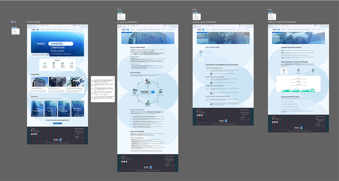
Sitemap

Wireframes
Next, paper wireframes were created to visualize early ideas with low commitment. This approach allowed for quick iterations and easy adjustments as the concept evolved.

Design
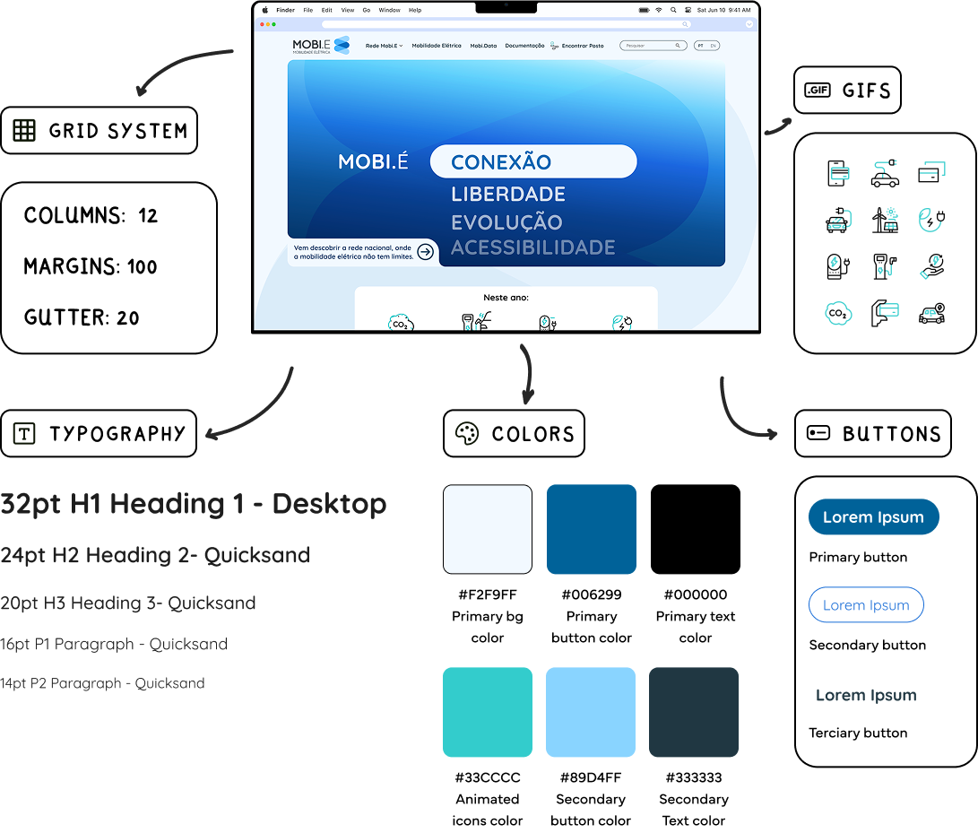
Finally, it was time to bring the ideas to life. Building on insights from the previous phase, the focus shifted to defining the visual direction of the final design. Key decisions were made around color palette, typography and hierarchy, iconography, and other UI elements to ensure a cohesive and accessible user experience.
UI Kit
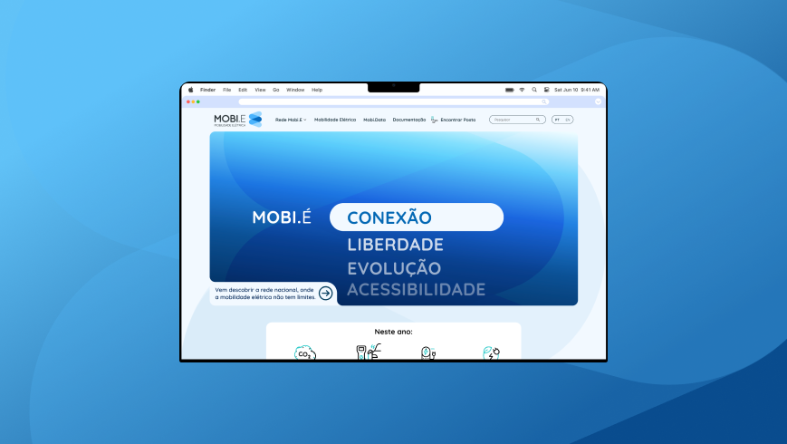
High Fidelity Prototype
Once the visual language was defined in the UI Kit, we translated the new structure into a polished, high-fidelity prototype. This phase focused on applying branding, layout, and visual hierarchy to deliver a realistic and cohesive user experience.