Overview
As part of a UX/UI design challenge, this project focused on improving the account management experience within the Revolut app, specifically the creation and deletion of accounts. While Revolut is known for its sleek interface and wide range of digital banking features, we identified pain points in how users onboard and offboard; crucial moments that can shape their overall trust in the platform.
Our objective was to streamline the account creation process for new users and make account deletion clearer and more transparent, ensuring both actions felt secure, intuitive, and user-friendly.
From research and usability analysis to prototyping and testing, this project delivered a solution that respects Revolut’s modern design language while reducing friction at key moments in the user journey.
Process

Discovery
Revolut is one of the world’s leading digital banking platforms, recognized for its sleek design and diverse features; from international transfers to budgeting tools and crypto trading. However, key user flows like onboarding and account cancellation still pose significant usability challenges.
The onboarding process spans around 28 screens, while account deletion can take anywhere from 4 to 9 steps, depending on the user’s status and account balance. For a platform known for speed and simplicity, these flows often feel unnecessarily complex.
To better understand the pain points, we conducted six usability tests focused on both journeys. For the account creation flow, I mapped out a detailed user journey to highlight the key friction points identified.
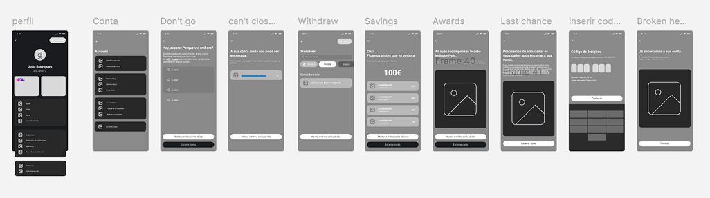
While Revolut offers a relatively straightforward way to close an account within the app, the experience still raises questions and emotional reactions for users. To better understand how people navigate this flow, we mapped out the entire process and conducted usability tests to capture real user feedback. What follows is a step-by-step walkthrough of that experience, highlighting moments of clarity, confusion, and frustration along the way.
- Opening the menu → mild anxiety
Users first dive into the hamburger menu hoping the process will be quick. The option isn’t immediately visible, so anticipation mixes with worry. - Account Settings → pleasant surprise
Inside Account Settings the “Close account” button is clearly labelled and high-contrast. Participants appreciated how easy it was to spot (“The option is quite highlighted”). - First Confirmation → hesitation kicks in
A persuasive interstitial asks “Where are you going?” and nudges users to keep the account. Testers understood the prompt but some found the copy lengthy and clicked Close account without reading fully. - Account Transfer Step → useful but unexpected
Revolut encourages users to transfer any remaining balance. Most testers liked the practicality (“Oh! This is quite useful”), yet a few wondered why this wasn’t surfaced earlier in the flow. - Rewards Reminder → positive reassurance
A screen warns that rewards will be lost if the account is closed. Participants valued the transparency (“Good to know I can easily cancel”) but suggested condensing the text. - Data-Storage Notice → strong negative reaction
The final step states that personal data must be retained for regulatory reasons. Almost all testers reacted negatively (“I don’t want them to keep my data!”) and requested clearer legal context and a timeframe for deletion.
Key Takeaways
- Findability is solid, but the journey starts with uncertainty because the entry point sits two taps deep.
- Persuasive screens are informative yet word-heavy; users skim rather than read.
- Utility steps (balance transfer) are well received but feel out of sequence.
- Data-retention messaging erodes trust; users need clearer explanations and the option to request data removal once legally possible.
- Overall ease is high, but emotional friction peaks at the end, exactly where confidence should be reinforced.
Problem Statement
While Revolut offers a feature-rich banking experience, two critical user flows; creating an account and closing one; present significant friction. During onboarding, users often feel overwhelmed by the excessive number of screens and the lack of flexibility in navigating the process. Issues like difficulty finding one's professional category, lack of inclusivity in options, and the inability to go back to previous steps lead to frustration and abandonment. On the other hand, the account cancellation journey, although shorter, suffers from poor visibility of key actions, lack of trust around data handling, and an unclear sense of closure. Users expressed doubt over whether their request was successfully completed and concern about what would happen to their stored data. These insights revealed a clear need to streamline both flows, enhance user guidance, and build greater trust and control at every step of the journey.
Persona

João is a 32-year-old freelance graphic designer based in São Paulo, Brazil, working with clients across Europe and North America. With a passion for travel and cultural exploration, he often takes advantage of his remote lifestyle to live and work from different countries. Balancing personal and professional responsibilities on the go, João relies on digital tools that offer speed, simplicity, and flexibility. He’s tech-savvy, values clear communication, and seeks solutions that streamline his daily routines; especially when it comes to managing his finances across borders.
- Simplified financial management
- Fair and transparent exchange rates
- Modern, user-friendly tools accessible anywhere in the world
- High fees from traditional banks
- Lack of real-time financial control
- Outdated, slow, and unintuitive banking solutions
- Manage both personal and professional finances in one place
- Avoid high fees on international payments
- Save on currency conversions while traveling
Strategy
At this stage, the main objective was to define the structure and behavior of the new website, with a particular focus on the homepage. After identifying key structural issues in the existing website, a revised site map was developed to establish a clearer, more intuitive navigation framework.

Competitive analysis
To better understand the current landscape of digital banking onboarding and account cancellation experiences, we conducted a competitive analysis of five key players: N26, Wise, Monzo, Moey!, and Revolut. This comparison allowed us to identify best practices, recurring pain points, and areas where Revolut could improve its user experience. We focused on elements such as process clarity, navigation flexibility, and technical reliability across platforms.
Wireframes
We started with paper wireframes to quickly sketch and explore possible directions for improving both the onboarding and account cancellation flows. One of our initial ideas was to introduce a progress bar in the onboarding process, breaking it down into four distinct stages to help users feel more guided. However, through early sketches and reflection, we realized this approach wasn’t effective; given the high number of screens involved, the progress indication would not accurately reflect the user’s true advancement. This phase was crucial in identifying such issues early on and setting a clear foundation for our digital wireframes.
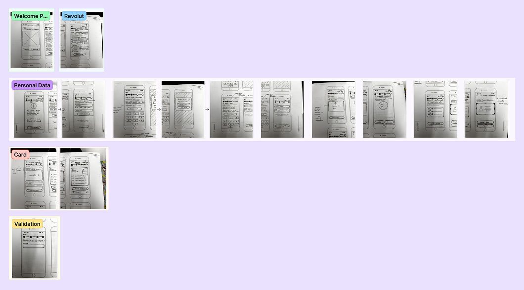
Since we were tackling two different processes, we also explored early ideas for the account cancellation flow. Given that this journey is more straightforward compared to onboarding, we opted for a low-commitment approach using a digital low-fi prototype. This allowed us to piece together different elements and test out possible directions quickly without spending too much time on polished wireframes at this stage.
Design
With the strategy clearly defined and initial ideas tested, we transitioned into the Design phase. This stage was focused on building clear, intuitive interfaces that improved the user experience across both onboarding and account cancellation flows. In terms of visual design, we chose to follow Revolut’s existing UI kit; adhering to the brand’s color palette, typography, and overall aesthetic. Our aim wasn’t to reinvent the visuals, but rather to make thoughtful UX-focused adjustments that simplify and enhance the overall user journey.
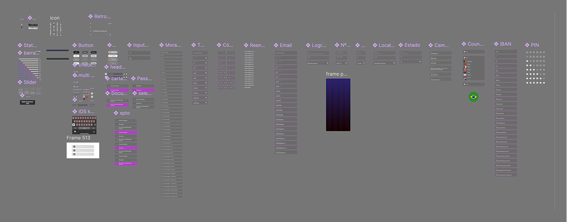
UI Kit
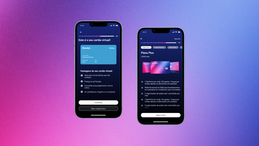
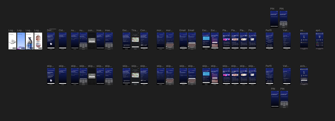
High Fidelity Prototype
With our visual guidelines in place, we moved on to building high-fidelity prototypes for both the onboarding and account cancellation flows. These screens reflect our UX refinements while maintaining visual consistency with the Revolut brand.
Usability Testing
To evaluate the effectiveness of our proposed solutions, we conducted usability testing both before and after implementing our redesigns. In total, 6 tests were run during the initial phase (on the current solution) and again at the end (on our proposed solution). We focused on three key metrics: ease of use, perceived security, and process duration.